Top 7 UI/UX Mistakes to Avoid in Property Rental App Development
Top 7 UI/UX Mistakes to Avoid in Property Rental App Development
Last Updated on May 30, 2025
Ever try using an app that feels like a maze? Annoying, right? In property rental apps, a confusing or cluttered design can make users bounce before they even see the listings. The secret to a winning app? Smooth, simple UI/UX that helps people find their next home without the hassle. But many rental apps fall into common design traps that kill user engagement and trust.
Whether you’re building from scratch or improving an existing app, knowing what mistakes to avoid is key. In this blog, we’ll walk you through the top 7 UI/UX mistakes in property rental app development — and how to fix them — so your users stay hooked and happy.
Top 7 Mistakes in Property Rental App Development
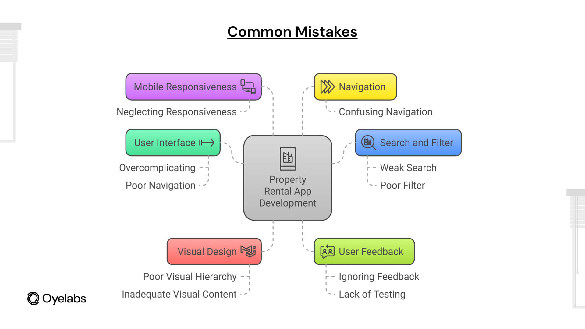 Developing a property rental app like Airbnb can be a lucrative venture, but it’s a complex process that requires a careful balance between functionality, usability, and performance. Many apps stumble because of common pitfalls that significantly impact user experience and business success. Below, we explore the top seven mistakes made during property rental app development, why they matter, and how to effectively avoid them.
Overcomplicating the User Interface
One of the most frequent mistakes in property rental app development is creating a user interface (UI) that is overloaded with too many features, buttons, menus, and options all at once. While the goal is to offer comprehensive functionality, cramming everything onto the screen can overwhelm users, detracting from their experience.
Why It’s a Problem:
- Cognitive Overload: When users are bombarded with excessive options, they struggle to focus on what really matters. For example, if a rental app shows too many filters, property details, and extra menus simultaneously, users may feel lost and frustrated.
- Navigation Challenges: A cluttered UI often makes it difficult for users to move smoothly through the app. Users may not find the ‘Book Now’ button or struggle to access the contact details of a landlord, leading them to abandon the app altogether.
- Aesthetic Issues: Overcrowded screens can look unprofessional and diminish users’ trust. A sleek, clean UI signals reliability and quality.
How to Fix It:
- Simplify Design: Strip down the interface to the core features essential for property searching and renting. Avoid adding every possible function at launch; instead, prioritize and expand gradually.
- Use White Space: Strategically place empty space around elements to improve readability and reduce visual noise. This makes the app easier on the eyes and enhances user focus.
- Prioritize Content: Highlight key actions such as searching for properties, saving favorites, or contacting landlords. Use visual cues like contrasting colors or larger buttons to draw attention to these elements.
Neglecting Mobile Responsiveness
With over 85% of internet users accessing websites and apps via mobile devices in 2024, mobile responsiveness is no longer optional. An app that doesn’t function well across various screen sizes risks losing a significant chunk of its potential audience. According to recent data, 57% of users won’t recommend a business with a poorly designed mobile site or app, highlighting how critical seamless mobile experience is for retention.
Why It’s a Problem:
- User Frustration: If your app’s layout breaks on smaller screens or interactive elements are hard to tap, users will quickly abandon it. For example, if the property images are cropped or buttons are too small on a phone, it leads to poor user experience.
- Reduced Accessibility: Some users rely entirely on their mobile devices. A lack of adaptability across screen sizes means these users cannot fully utilize the app’s features.
- Negative Perception: In today’s competitive market, a non-responsive app appears outdated and unprofessional, potentially damaging your brand image.
How to Fix It:
- Responsive Design: Employ flexible layouts that automatically adjust to screen sizes, whether it’s a smartphone, tablet, or desktop.
- Device Testing: Continuously test the app across various devices and operating systems to catch and fix inconsistencies.
- Touch-Friendly UI: Design buttons and interactive elements large enough for comfortable tapping, typically 44×44 pixels minimum, to avoid accidental presses.
Also Read: Business Lessons from the Rise of Airbnb
Confusing or Poor Navigation
Navigation is the backbone of user experience. A property rental app with confusing navigation can frustrate users who want to find available listings quickly or manage their bookings with ease.
Why It’s a Problem:
- User Disorientation: If menus are hidden, labels are unclear, or users have to guess where certain functions reside, they get lost within the app.
- Increased Bounce Rates: Users won’t spend time trying to figure out how to use the app; they’ll leave and seek alternatives.
- Reduced Engagement: Without intuitive navigation, users are less likely to explore additional features like saved searches, notifications, or user profiles.
How to Fix It:
- Consistent Navigation Patterns: Stick to familiar structures such as bottom tab bars for primary sections (Search, Favorites, Profile) or hamburger menus for secondary options. Consistency reduces the learning curve.
- Clear Labels: Navigation options should be described clearly (e.g., “My Bookings” rather than ambiguous terms like “Trips”).
- Search Functionality: Incorporate a powerful, easy-to-use search bar that helps users jump directly to listings or landlords without browsing through multiple pages.
Weak Search and Filter Functionality
For a property rental app, the ability to quickly find the right property is the core value proposition. Poor search and filtering capabilities frustrate users and reduce the chances of booking.
Why It’s a Problem:
- Inefficient Property Discovery: Users might have specific criteria like location, budget, pet policy, or number of bedrooms. If the app cannot handle detailed searches, users waste time scrolling through irrelevant listings.
- Time-Consuming: Browsing without filters is slow and tiresome, making users less likely to return.
- User Dissatisfaction: When users cannot find what they want efficiently, their perception of the app suffers.
How to Fix It:
- Advanced Filtering: Provide a broad range of filters such as price range, amenities, lease terms, and property type.
- Auto-Suggestions: Enhance the search bar with predictive typing to speed up searches and reduce errors.
- Save Searches: Let users save their favorite search criteria for quick access later, increasing retention.
Poor Visual Hierarchy and Typography
Visual hierarchy dictates how users perceive and process information on the screen. Poor typography and layout can make an app feel confusing and unprofessional.
Why It’s a Problem:
- Information Overload: When headings, subheadings, and body text look similar, users struggle to differentiate important from supplementary information.
- Readability Issues: Small or decorative fonts may look nice but hinder readability, especially on mobile devices.
- Aesthetic Displeasure: Typography directly impacts how polished and credible an app feels to users.
How to Fix It:
- Establish Hierarchy: Use font size, weight, and color to distinguish between titles, subtitles, and body content. For example, property prices should stand out more than the descriptive text.
- Readable Fonts: Choose clean, modern, and widely supported fonts that are easy to read on all devices.
- Consistent Styling: Maintain uniform font styles and spacing throughout the app to help users become familiar with the structure.
Also Read: The Vacation Rental Challenges
Inadequate Visual Content
In property rental apps, visuals are everything. Listings without high-quality images or videos fail to attract and convince users.
Why It’s a Problem:
- Lack of Engagement: Users rely heavily on images to make decisions. Poor or missing visuals reduce interest.
- Trust Issues: Low-quality photos may cause users to question the legitimacy or quality of the property.
- Competitive Disadvantage: Competitor apps with better visuals will naturally attract more users and bookings.
How to Fix It:
- High-Quality Images: Ensure every listing has bright, clear photos taken professionally or using good cameras.
- Virtual Tours: Incorporate 360-degree views or video walkthroughs to give users a comprehensive feel of the property.
- Image Standards: Keep a consistent image size and quality standard across listings for uniformity and professionalism.
Ignoring User Feedback and Testing
User feedback and regular testing are vital for ongoing app success. Neglecting these can result in unresolved bugs, poor UX, and declining user engagement.
Why It’s a Problem:
- Unaddressed Issues: Without feedback loops, developers may miss critical bugs or usability pain points that reduce satisfaction.
- User Frustration: Persistent problems without fixes lead to negative reviews, bad ratings, and churn.
- Missed Opportunities: Feedback often uncovers user needs or feature requests that can help the app evolve and grow.
How to Fix It:
- Regular Testing: Perform thorough usability tests before and after releases to identify issues proactively.
- Feedback Channels: Embed easy-to-access feedback options like surveys, chat support, or rating prompts.
- Iterative Improvements: Adopt an agile approach to continuously enhance app features based on real user insights.
By carefully avoiding these common mistakes, property rental apps can provide seamless, user-friendly experiences that drive engagement, build trust, and ultimately grow their user base. Prioritizing simplicity, responsiveness, intuitive navigation, strong search features, polished design, compelling visuals, and responsive feedback loops will set your app apart in a competitive market.
Ready to Launch Your Property Rental App?
Don’t let design missteps hold your idea back. Our Airbnb Clone is built to help you launch faster—with full customization, mobile-ready design, and must-have features like advanced booking, host dashboards, and secure multi-payment support. You’ll be live in just 72 hours, backed by full source code ownership and ongoing post-launch support.
Already trusted by 100+ entrepreneurs worldwide, our solution delivers both speed and reliability. With a 7-day delivery commitment, you skip the delays and start scaling from day one. Let Oyelabs turn your property rental concept into a polished, high-performing app. Let’s build your Airbnb-style platform the right way.
Conclusion
Creating a standout property rental app goes far beyond coding—it’s about crafting a user experience that feels effortless, intuitive, and trustworthy. The seven UI/UX mistakes we’ve covered—like overloading the interface, overlooking mobile responsiveness, or skimping on visual clarity—can quickly frustrate users and drive them away. Avoiding these pitfalls isn’t just best practice—it’s essential in today’s competitive rental app market. When design meets user-centric thinking, you build more than just an app—you build a platform users trust to find their next home. Focus on simplicity, responsiveness, and continuous user feedback, and your property rental app won’t just function well—it’ll win hearts (and downloads).